Website and design system for DriveTime
DriveTime's separate mobile and desktop sites created inconsistent experiences and doubled feature work. I led a responsive redesign to unify the sites, increasing conversion 4.9%.
My role: Strategy • Wireframes • Design System • UI/UX Design
Twice the work for half the benefit
Challenge: DriveTime was operating separate mobile and desktop websites, which slowed down our workflows and created an inconsistent user experience. We were also designing and developing all of our UI elements à la carte.
- Engineers and UX were developing and designing everything twice
- Desktop site had fallen behind on design, content, and functionality
- UI was inconsistent and messy
Goals and success metrics:
- Primary business goal: Build a unified codebase and consistent user experience across mobile and desktop
- Mobile first: Use the mobile experience as our source of truth
- Design system: Streamline the UI and build a scalable, future-proof design system
- Primary success metrics: Session to lead, bounce rate, time to market
Obstacles: We decided to freeze all development to give ourselves a stable foundation so we needed to move as fast as possible to minimize experimentation downtime. I worked with our product management team and engineers to create a strict timeline and we set regular touchpoints to discuss blockers and keep things moving forward.
Foundation for the future
Existing site structure and user data
Wireframes: Before getting into design, I wanted to be sure I understood how our existing site was built. I met with our engineering team to dig into the architecture of both sites and created some quick wireframes.
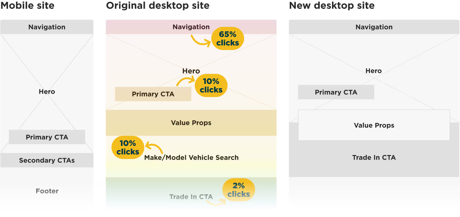
Heatmaps: Our analytics team gathered click data for all of the desktop pages so I could create heatmaps identifying the most impactful elements. This informed the scope of the redesign.
Future sitemap: Working with our product and executive teams, we used the wireframes and heatmaps to prioritize which elements and pages would be rebuilt first. I created a sitemap based on that scope to use as an outline of the project going forward.

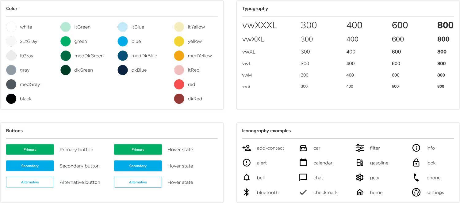
Building a design system
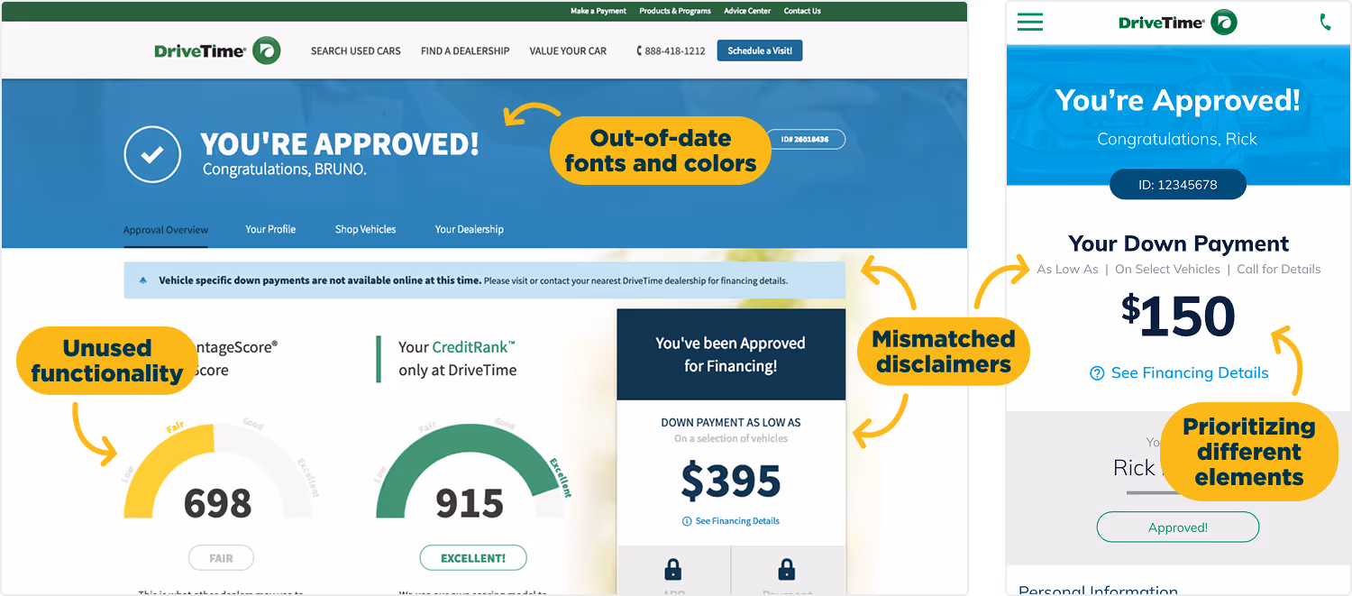
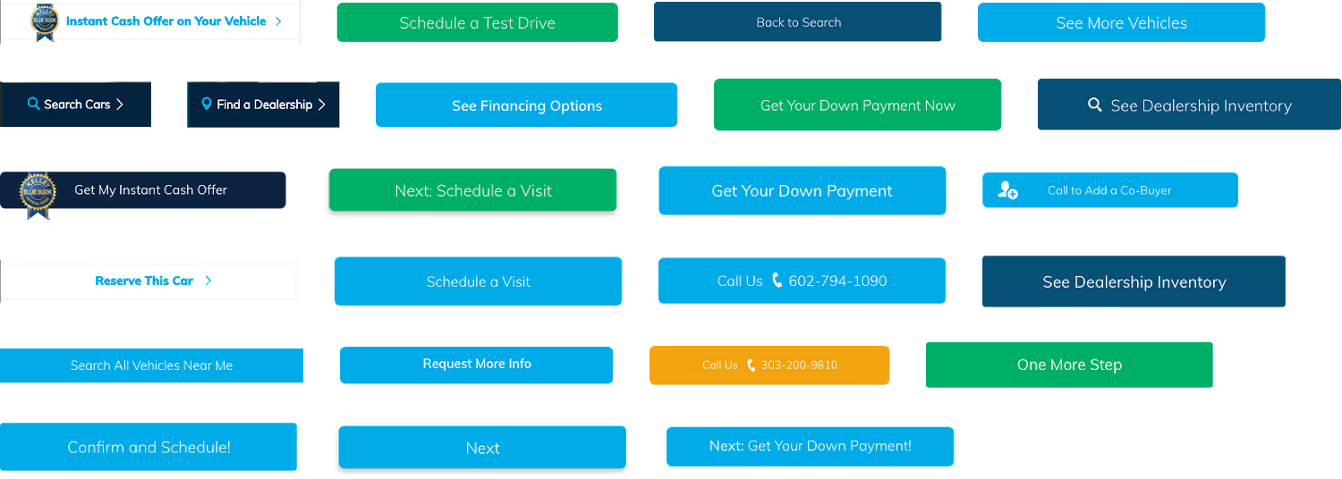
UI audit: Since all of the UI elements (including color, typography, and spacing) on our site were just a little bit different from each other, I did a full-scale UI audit in order to understand where there was opportunity to define components and tokens. In the example below, I discovered that we had 24 different button styles.
Tokens and components: I standardized the design of our UI elements as needed to create a streamlined, scalable component library that could grow with us. I also worked with our engineers to define tokens for colors, typography, and interaction states to keep design and development teams aligned.
Final designs
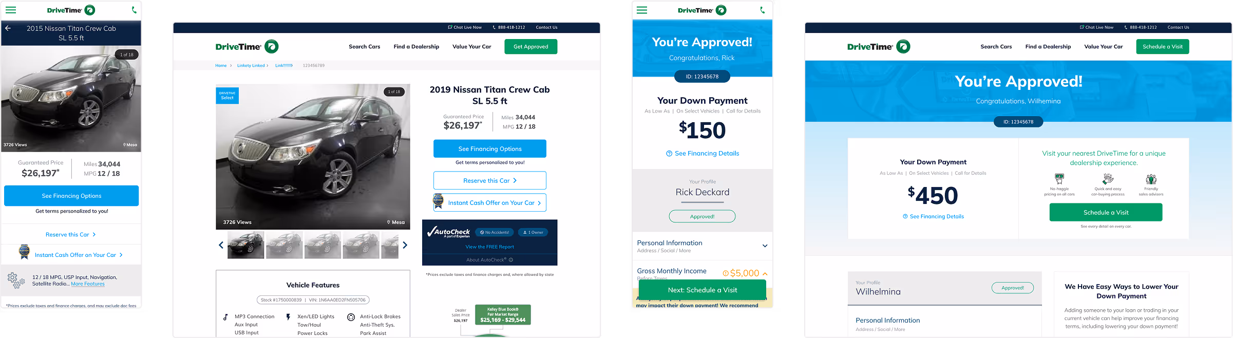
I created mobile, tablet and desktop mockups for the entire sitemap based on the wireframes and design system. My goal with my designs was to prioritize ease of development while maintaining continuity for our existing desktop users.

Results of the redesign
One month after we launched our new site we were seeing positive trends in key metrics.
4.9% increase in financing conversion
9.1% decrease in bounce rate
Reduced time to market by 1-3 weeks per feature
The responsive redesign and design system set up a foundation for us to iterate and experiment more effectively, creating opportunities for future optimization and enhancements.