
Self-service portal for warranty customers
SilverRock's customers were consistently calling in just to ask basic questions about their vehicle warranties. I redesigned their website to help people find answers and start claims on their own with the goal of reducing calls and making the experience more helpful.
My role: Strategy • User Research • Design System • UI/UX Design

The problem: lack of information and functionality
SilverRock approached our team because their current site had stagnated and based on both user and agent feedback, several problems had popped up over time:
- High volume of calls: Most customer calls were purely informational. How do I start a claim? What is the process? What is covered?
- Inefficient use of space: Important information and CTAs were pushed down the page by unecessary elements, making them hard to find.
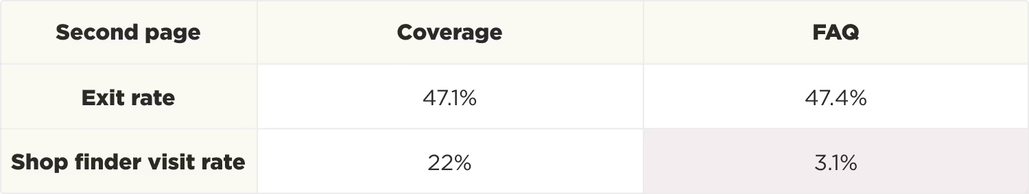
- Lack of detailed coverage information: The coverage page didn't clearly explain what was covered or the differences between limited and extended warranties.
- Difficult to navigate: The site lacked clear paths to the shop finder page which was the only way for users to find in-network repair facilities and start claims.

In addition to the user feedback, we dug into the analytics to identify the most and least helpful entry points. Since finding a repair shop was the main value proposition of the site, we specifically looked at bounce rate and shop finder visit rate by landing page.

People who landed on the homepage were most likely to get to the shop finder, while those who started on the FAQ were more likely to bounce. Based on that, we traced the path users took from the homepage to see how they moved through the site, and found that FAQ continued to be a problem page.
Process: building a self-service experience
After analyzing the user complaints and friction points, we divided the business requests into high and low priority.

Shop finder task flow: Since the repair shop finder was one of our highest priorities, I started by mapping out all the ways users might interact with it, including edge cases. Together with our engineers, we identified potential failure points where users could get stuck and minimized dead ends while keeping development timelines realistic.

Content library: The FAQ, process, and coverage pages seemed to be confusing customers and causing them to exit the site, so I worked with our copywriter to create clear, usable content for the redesign. She rewrote the pages in plain language, organizing information around actual customer questions rather than internal categories.
Wireframes: My last step before diving into visuals or UI decisions was creating lo-fidelity wireframes for the main flows of the site. We used these to work through functionality, content, and navigation decisions with our engineering, leadership, and legal teams.

Final designs: bringing it all together
The existing site had inconsistent styling, which added to the confusing user experience so my first step was to create a design system that established clear visual hierarchy and consistent components. I used elements from existing marketing materials as a starting point to maintain brand recognition.

With the user flows, content, and design system established, creating the high fidelity comps was straightforward. The final designs included complex interactions that were difficult to communicate in static mockups, so I created interactive prototypes for mobile and desktop. This helped to test the flows and communicate the intended functionality with our engineering team.
Example prototypes:
(click anywhere to highlight interactive elements)
Next steps
Development work started on this project, but was paused due to shifting business priorities. Features have been written and scoped for the design system and prototypes, and are ready for implementation when development resources become available again.