Decreasing abandonment on financing application
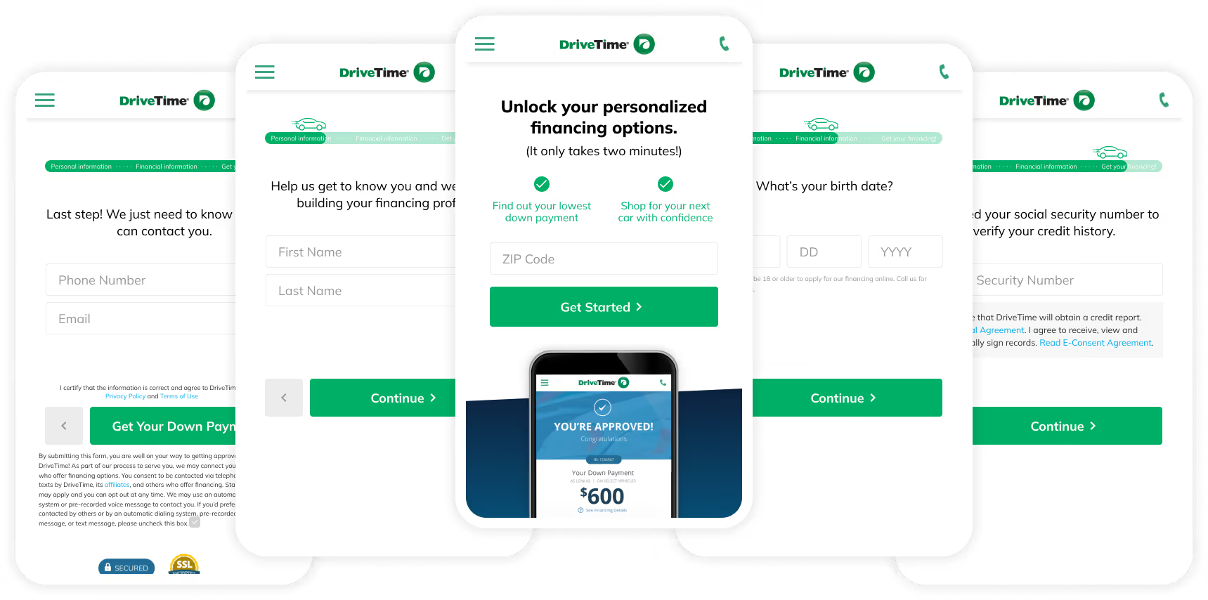
DriveTime is a used car sales and financing company that provides instant online vehicle financing. They were losing nearly 600,000 potential leads per month to form abandonment so I designed a step-by-step application to guide users through the process. The new form increased total completions by 6% and allowed for more detailed data collection for future iteration.
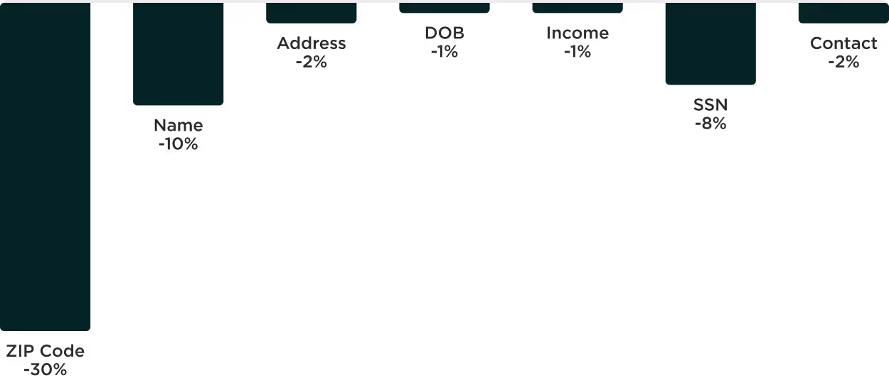
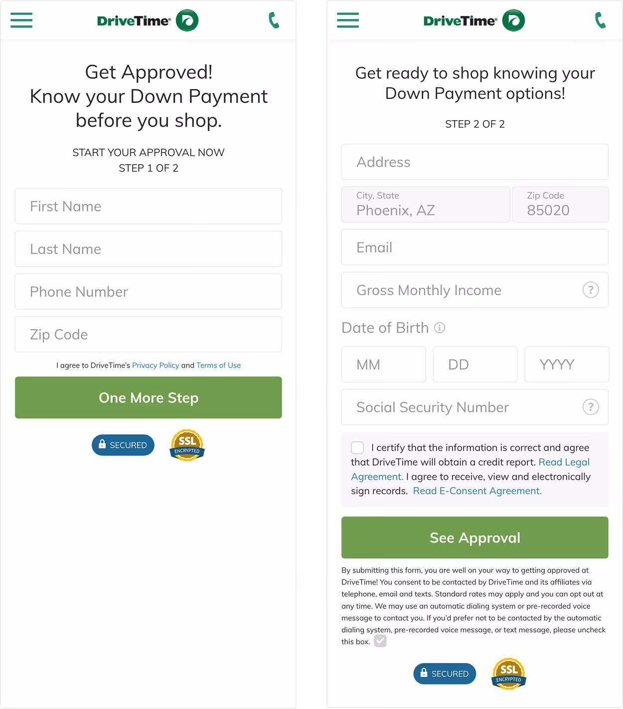
DriveTime's two-page financing form had a 56% abandonment rate with 48% of users exiting on the first page alone. We also couldn't pinpoint which questions drove the most drop off because of the way the form was originally built.
Objectives: Our primary business goal was to increase top-of-funnel conversion by reducing friction on the financing form. Our secondary objective was to identify which questions were driving the most exits.
Known obstacles: The original form was able to collect leads from either page, but the redesign would require full completion. This meant we needed an increase greater than 3.3% to offset the partial leads we would be losing.
1. User research
In conversation with our core customers we learned that they had often been rejected for financing elsewhere so our approval promise drove confidence. They were also concerned with receiving too many calls and emails.
2. Competitive analysis
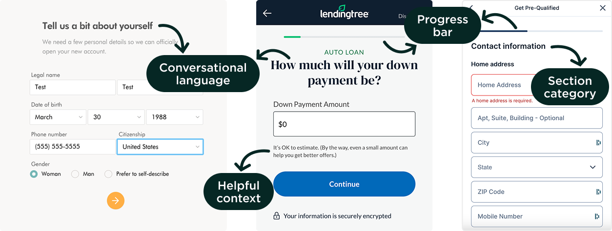
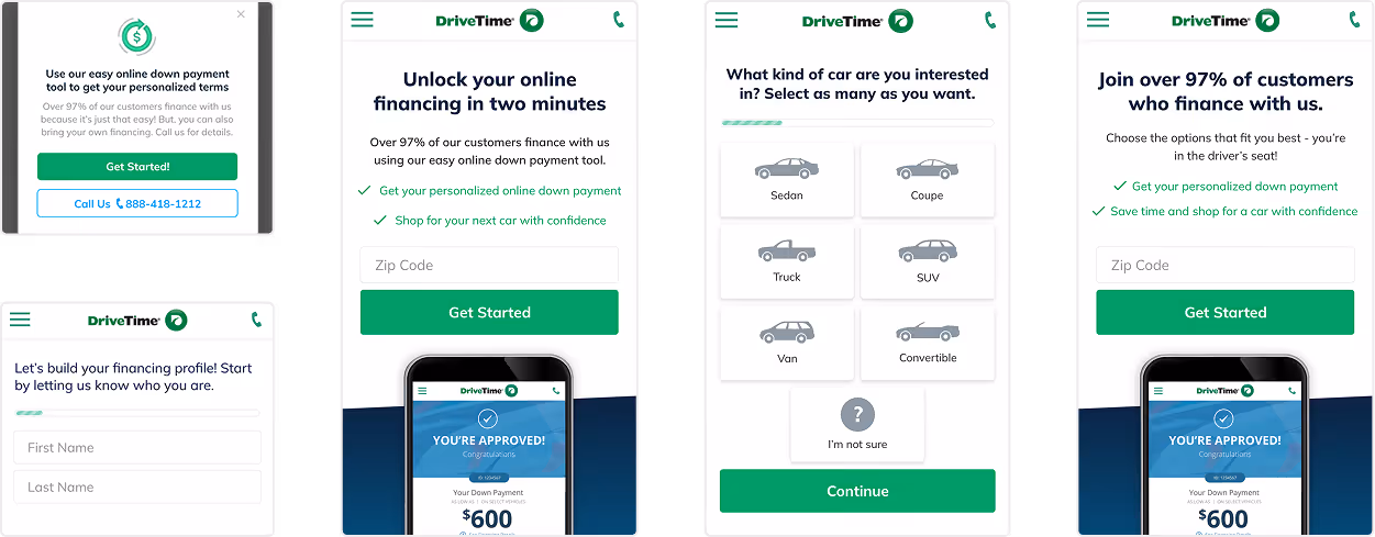
Exploring other financing websites showed that most were focused on conversational language and providing context to help inspire confidence with users as they moved through the form. LendingTree in particular inspired me to look into the step-by-step form.
3. Iterative experimentation
We ran preliminary A/B tests rearranging the form fields across the first and second page and discovered that moving the phone number field to the second page increased the total completion rate by 1.5% over the control experience.
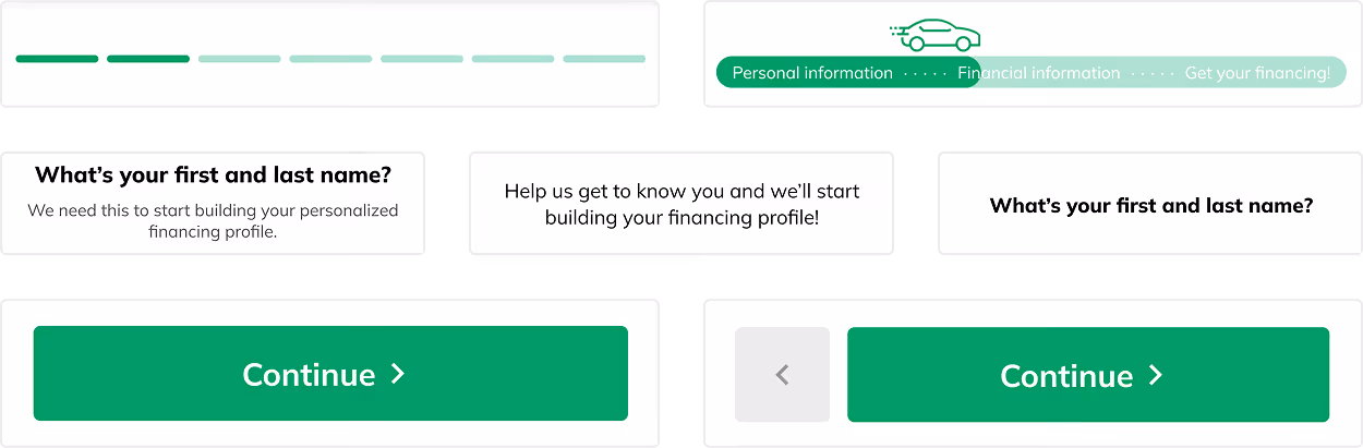
4. Ideation and solutions
Based on our research, we focused on four key aspects in the new form design.
The top performing variation of the new form increased completions by just over 6%, which cleared the 3.3% threshold we had set. However, when we worked with our analytics teams to dig into the data further we saw that the increase was largely due to lower quality leads. Based on this, we made the decision to move forward with the original form.

We also took away key learnings that informed our future designs